


In this example, we will create an amazing user interface, that simulates a dashboard and management app. Let’s start!
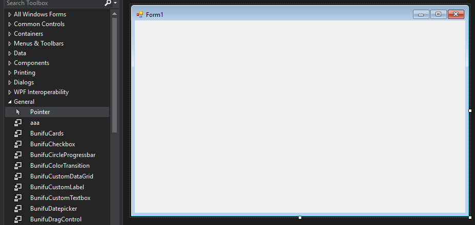
In the first step, you have to create a new Windows Forms app and reach the following window:
Ensure that Bunifu Framework is installed on your system!
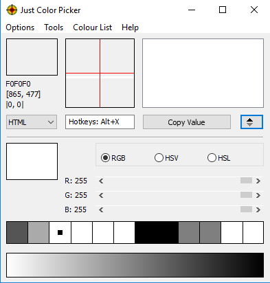
An interesting tool that we’ll use to deal with colors is Just Color Picker that you can download from this website.
Basically, we’ll use it to identify colors and to find colors that are suitable to our control. It looks like that:
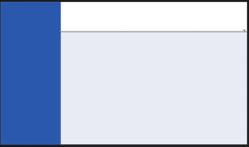
Now go to your form (click on it), go to Properties and set the following properties: FormBorderStyle set on None and BackColor to White.
You will get a white screen, with no borders.
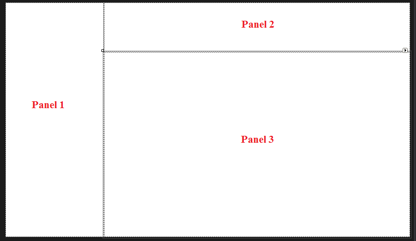
Now drag 3 panels on the form, and for the first panel set Dock to Left, for the second set Dock to Top and for the last one set Dock to Fill. Arrange them to get the following window:
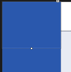
Now go to panel 1 and set the BackColor to 42, 88, 173 and on panel 3 to 232, 235, 243.
You’ll get the following colors:
Now place a panel inside the panel 1 and dock it to Top, in order to get that layout:
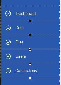
As you can see, our panel has been split into 2 parts: the part on the top, that we’ll use to add a profile photo (later on), and the part on the bottom, where we’ll add right now 5 flat buttons, with Dock set to top.
Name them like that: Dashboard, Data, Files, Users and Connections. Please make their back color identical with the panel’s one. You’ll have to achieve the following result:
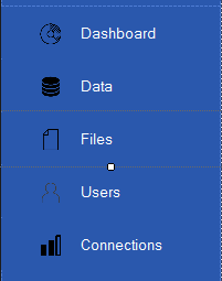
Now it’s time to customize the buttons. We need to update the icons. You can find a lot of interesting icons from this website.
You can simply add an image to a BunifuFlatButton by setting the IconImage property and browsing to the desired image. You can also adjust the size of the image using the IzonZoom property. Playing with those properties can lead you to a result similar to this one:
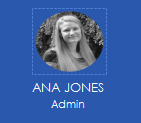
Next, we have to deal with the profile section (the top side of the Panel 1). We can add a picture box (with the portrait that we want) and then we can add a label below it with the name of the person. This is an example:
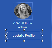
For the Update Profile option, you can add a Bunifu Flat Button that can be modified to match the design (setting the background to transparent, border line and text to white) and you can get the following result:
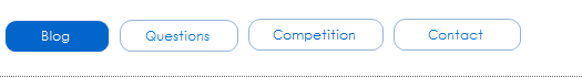
Now, for the Panel 3, we can just put another 4 thin buttons in order to create a tab-like panel. We can adjust them using the border line color and idle fill color and we can make them look like that:
Now all we have to do is to finish the 3’rd panel. Let’s add some panels and put them in the following layout:
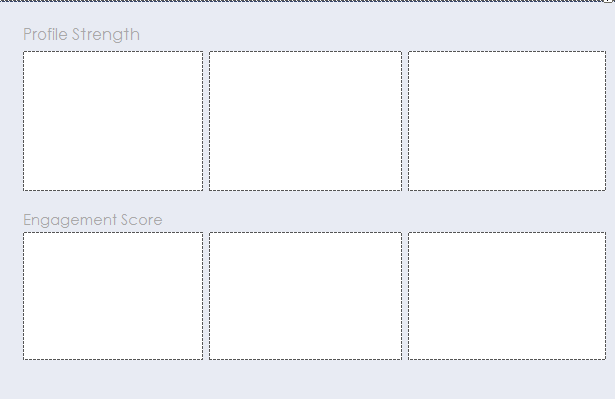
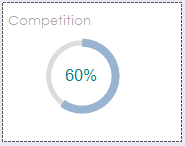
In the first small panel, we’ll use a Circle Progress Bar to illustrate the competition percentage. We just drag and drop a Bunifu Circle Progress Bar and set it’s value (and it’s color) exactly as we want:
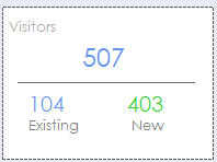
For the second small panel, we will use a Bunifu Separator to separate the number of existing visitors to the number of new visitors:
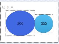
Also, the Q & A panel can be simple done using 2 picture boxes:
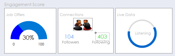
Finally, the enagagement score panels can be simply done using a Bunifu Gauge and a Bunifu Circular Progress Bar (animated) and we can make them look like that:
Notice that we didn’t do anything very complicated, just playing with the properties of each control (especially colors).
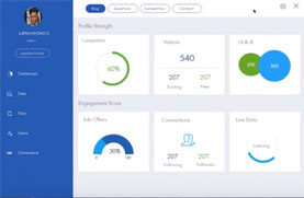
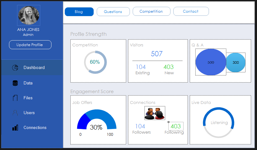
As a final result, this is what we just done:
We can easily bind each control to a property and control it’s value from our code (using the required properties).
I hope you like it and find it helpful!
Below is the full length video that shows in detail what we described in this article:
Please share and leave a comment 🙂

Leave A Comment