


In this article we’ll see how can we do a sliding menu using Bunifu Transition control. Let’s see it working!
First of all, create a new Windows Forms application and drag a Bunifu Ellipse on the main form. We’ll see the following window:

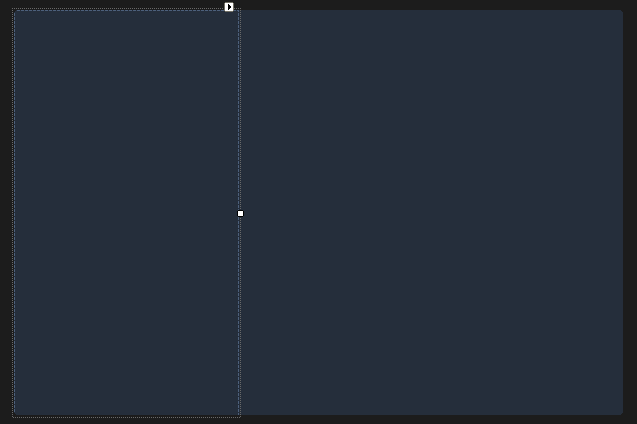
Now just drag a new panel on the form and dock it to the left (set the Dock property to the value Left). After doing that, set the back color to the value 37, 46, 59 and you’ll have to reach that layout:
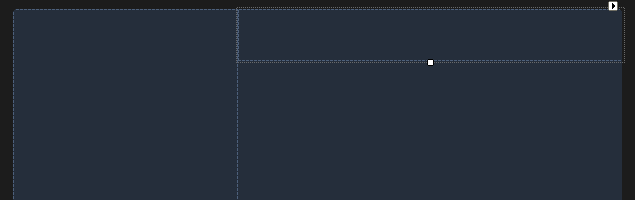
Now add a new panel and set it’s Dock property to Top. You’ll reach that layout:
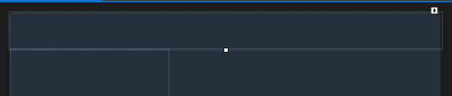
We want that third panel to be similar to a top bar (we’ll add a styled text on it) so we have to make it on top on all the other panels. In order to do that, just right click on it and click on “Send To Back” and you’ll get that result:
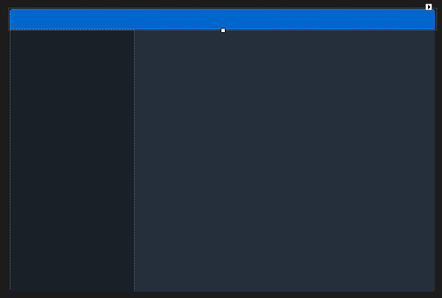
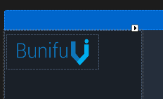
Now let’s adjust the color scheme: set the back color of the side panel (panel 1) to 26, 32, 40 and the back color of the top panel to 0, 102, 204 and you should get the following result:
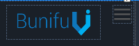
Now add a new picture box to the panel 1 and insert the Bunifu Logo into it (you can download it from the official website by just right clicking on it and then clicking on “Save Image As”) or you can use any logo you like 🙂 Just place it and adjust it’s size:
Next, let’s add a material-like button we’ll use to slide the menu:
Now let’s add drag to our form. In order to do that, just drop a Bunifu Drag Control on our form and set it’s “Target Control” property to the header panel (the panel on the top). Test it and see it working! (It’s a pretty straight forward configuration).
Let’s design the top panel also:
(The font is Century Gothic and the icons have been taken from this website).
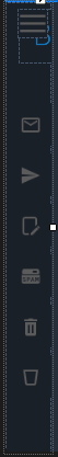
Now add 6 Bunifu Flat Buttons on the first panel and arrange them like that:

Put their background color identical with the underlying panel and attach an icon to each image. You may get a result similar to this one:

Now check the current width of the panel and write it down somewhere. Next, drag the panel to the left in order to see just the icons of the buttons, like that:
Check that width and write it down too. This is the state where the panel is slided. Notice that we need to hide the logo before doing that minimizing step.
In order to do the animation, we need to use the Bunifu Transition control. Drop it on the form and let’s add the following code to make it work:
[code lang=”csharp”]
private void pictureBox2_Click(object sender, EventArgs e)
{
/* This is the width of the expanded panel */
if(panel1.Width == 223)
{
panel1.Visible = false;
/* Hide the logo */
pictureBox1.Visible = false;
panel1.Width = 68;
bunifuTransition1.ShowSync(panel1);
}
else
{
panel1.Visible = false;
panel1.Width = 223;
/* Show the logo */
pictureBox1.Visible = true;
bunifuTransition1.ShowSync(panel1);
}
}
[/code]
Panel 1 is our sliding panel, pictureBox1 is the logo (that we need to show / hide depending on the sliding direction) and pictureBox2 is our sliding button (the button that we press to slide the menu).
You can check it now and see that it really works!
For a video demo on how we did it, check out the video below:
I hope you will find this useful. Leave us some comments and share 🙂


Hello. I have something to ask. I want to animate the slide menu. inserting bunifuImageButton1 inside the panel. But https://youtu.be/teqYKcj62VA the buttons are hidden from the panel without moving. How did you do that?
Please make use of anchors, I suggest you also watch the video step by step, reduce the speed – all the details are covered there. Thank you.
how can i slide the panel from right to left?
how can i slide the panel from right to left? what happened on the video is, the sidepanel just changed its width to 50 after hiding the sidepanel. it didn’t have the animation vertslide from right to left.