In this article we will see how can we create a modern Sign In / Sign Up form using Bunifu UI. Let’s see how!
First, create a Windows Forms application, add a Bunifu Ellipse on the main form and set it’s BackColor to 36, 49, 60. You’ll get that color:
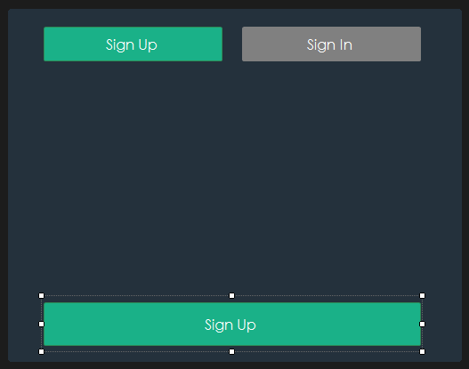
Now add 3 BunifuThinButtons, set their corner radius and their idle fill color to match that one (the green color is 26, 177, 136):
Let’s see how the Sign In form looks like (using Bunifu Metro Text Box):
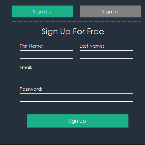
As you can see, there is just an eye for design. The form for the Sign In is similar to this one:
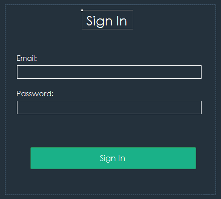
Let’s see how we can switch from a panel to the other! First, make sure that the panels are arranged in this way:
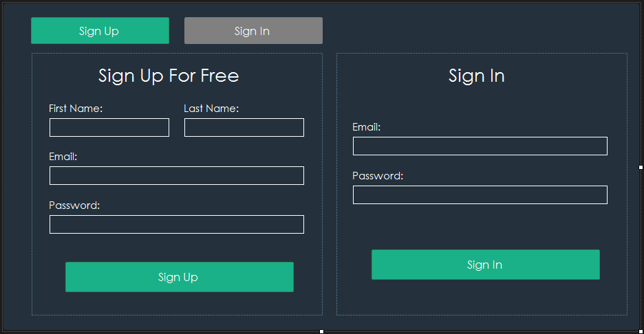
In order to switch between them when pressing on the upper buttons, let’s handle their event handlers and put the following code into them:
[code lang=”csharp”]
private void bunifuThinButton22_Click(object sender, EventArgs e)
{
panel1.Visible = true;
panel2.Visible = false;
panel1.Left = 41;
}
private void bunifuThinButton21_Click(object sender, EventArgs e)
{
panel2.Visible = true;
panel1.Visible = false;
panel2.Left = 41;
}
[/code]
Panel 1 is the left one and Panel2 is the right one. Just test it and see it working. Remember that in designer you should decrease the width of the outer panel to be visible only the panel 1:
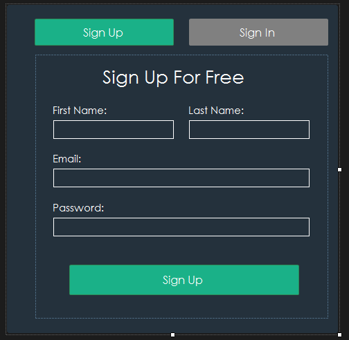
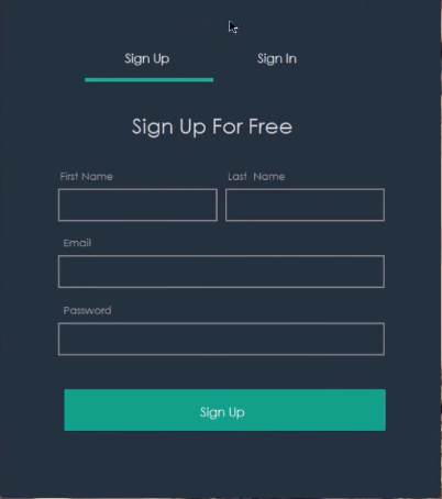
In order to see it in action, please check out this video.
I hope you will find the helpful. Leave us some comments and share 🙂





Leave A Comment