


At first glance, when you think about re-designing the standard Windows Form in your .NET project to make it as stunning as possible, the odds are always so high that you won’t get as far as providing drag movements for your Forms at runtime. But… Imagine if you could just get a borderless Windows Form to do exactly what the standard, resizable Windows Form can do — that is, resizing it, double-clicking the Title Bar to expand or restore the Form, and even docking it in any of the “hotspot” areas within the Desktop’s screen while still having your own customized and UX-friendly Form designed entirely from scratch?
The glamor of productivity in such added niceties could simply be amazing, and that’s exactly what Bunifu’s Form Dock component does all for you!
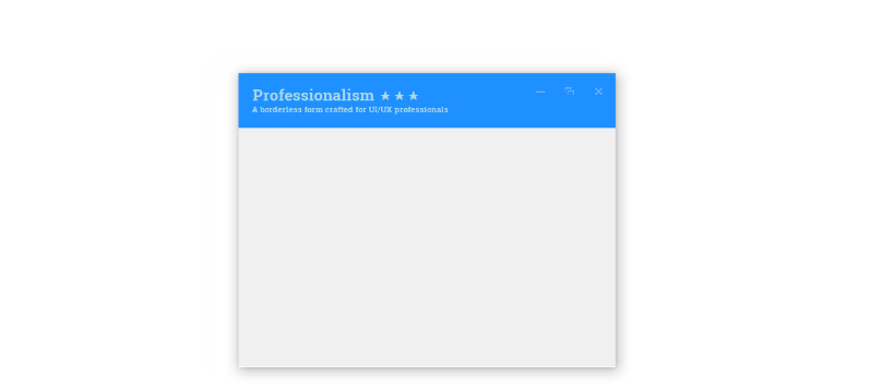
Lemmie give you a sneak little preview of what I mean…
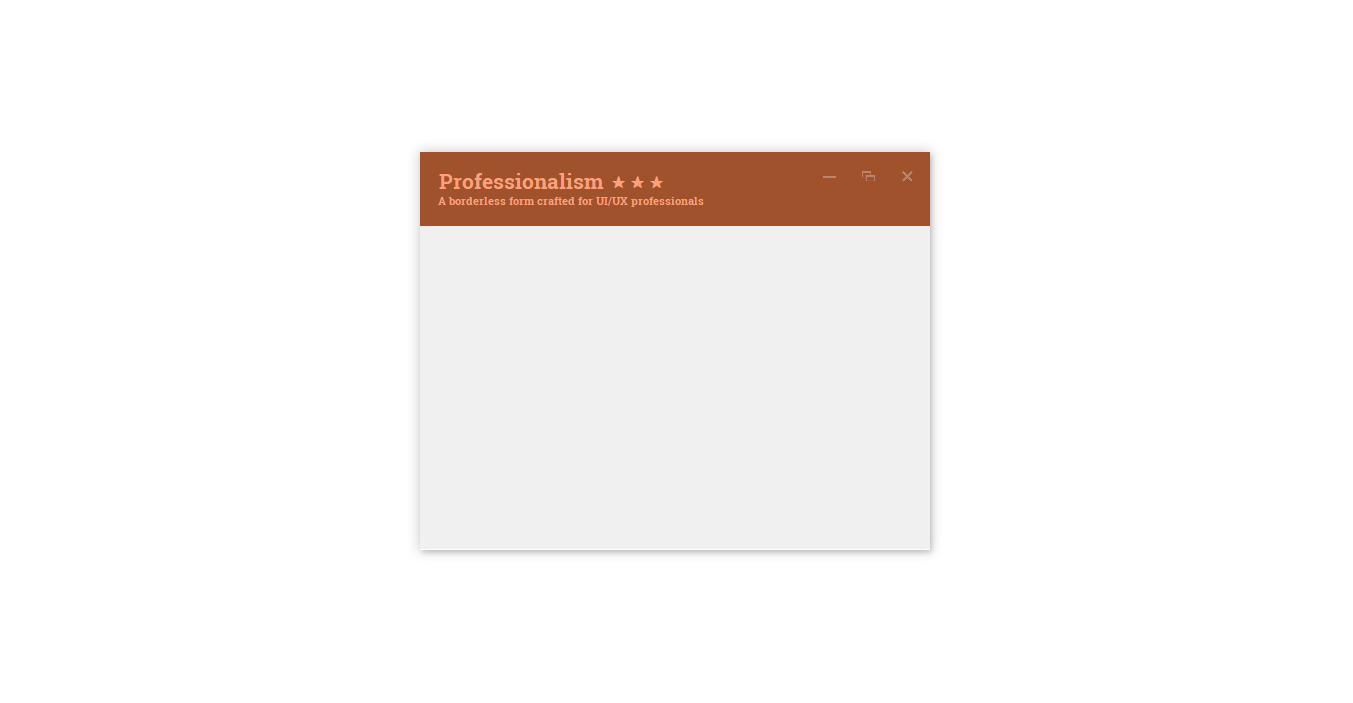
And here’s another one…
That’s the splendour of this feature-rich Bunifu component.
In this short blog article, we’ll be taking a quick look at how to integrate this component inside a very basic custom borderless form; so let’s get our design-gears running…
As always, ensure you have a copy of the Bunifu UI Framework library.
The Design Process
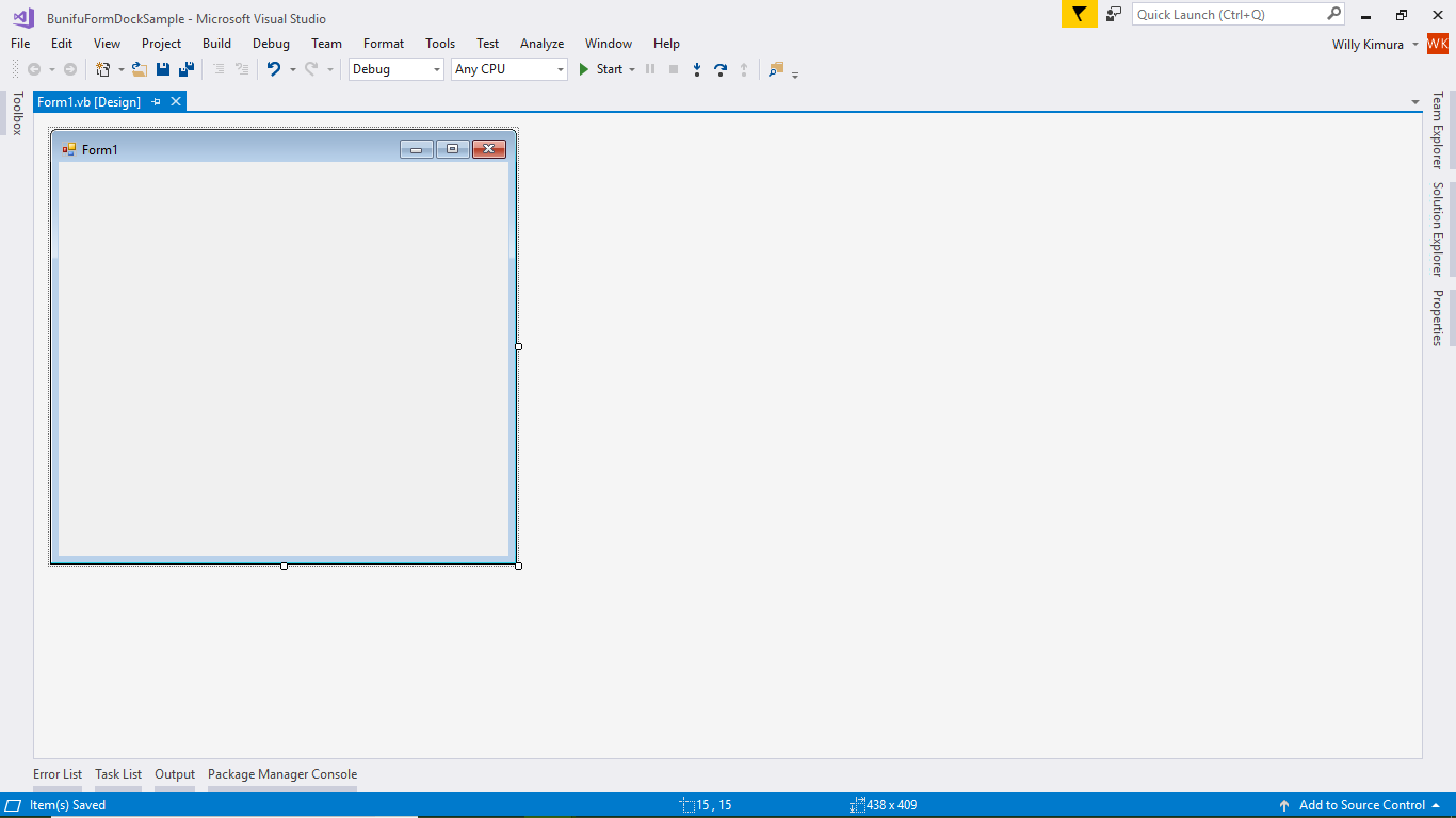
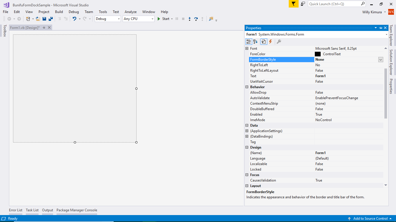
- Launch Visual Studio and create a new WinForms Project of whatever language you’d prefer; we’ll be working with both C# and VisualBasic .NET in our code samples. Once done, you’ll have your very own form created:
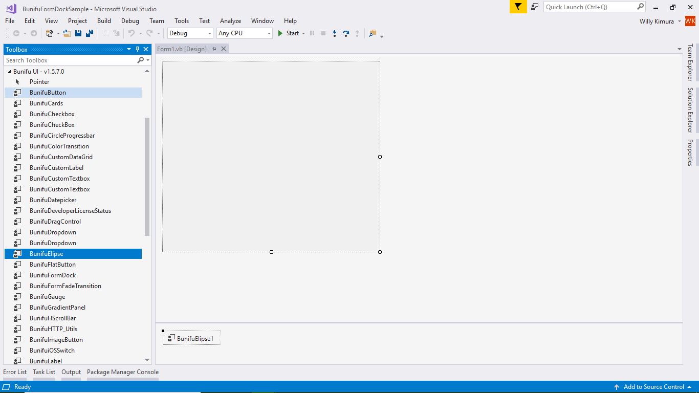
- Next, change your Form to borderless by setting the property FormBorderStyle to None. You can likewise use a Bunifu Ellipse component to automatically set your Form to borderless once you drag it to your Form.
- Here’s an example on achieving a borderless Windows Form by adding a Bunifu Ellipse component to the Form…
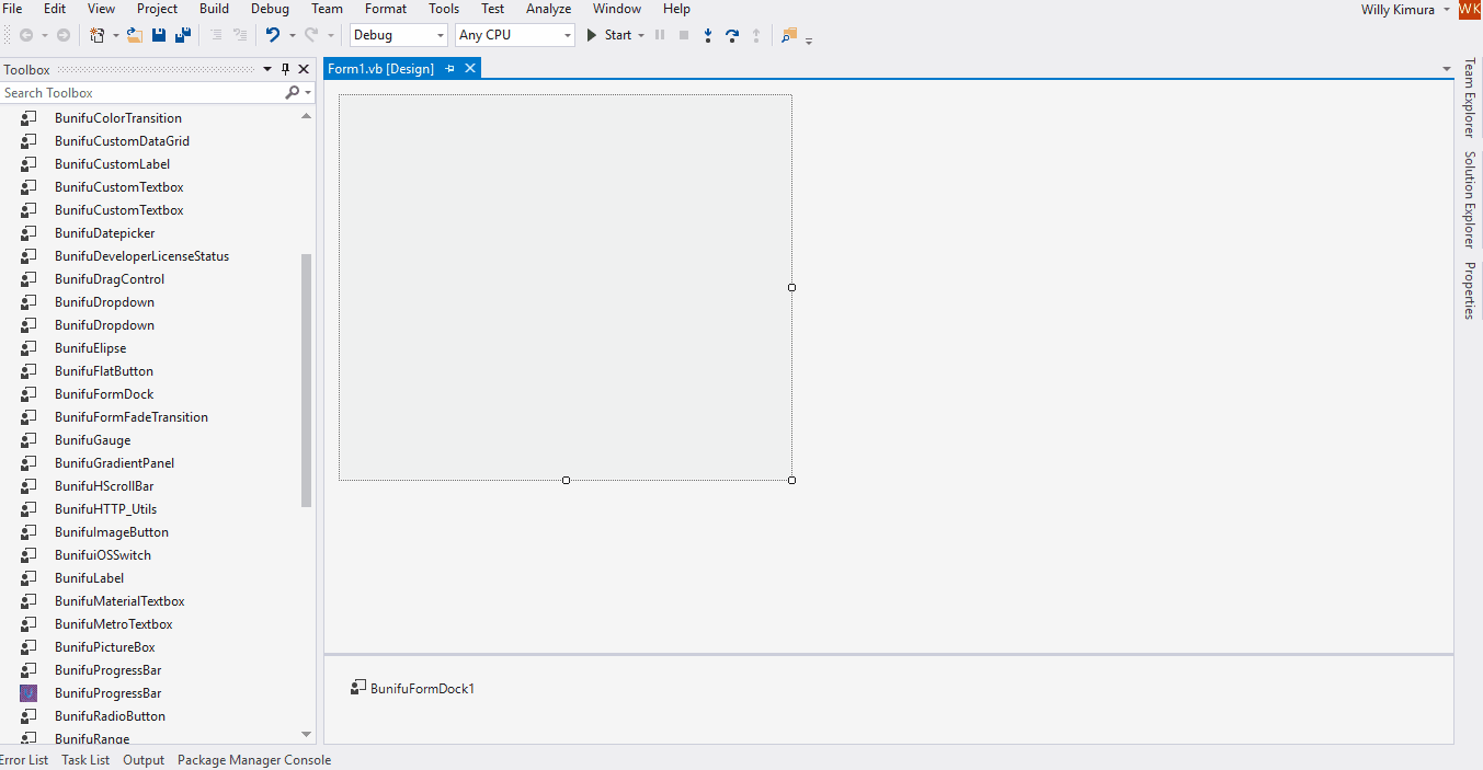
- Once done, we can now move to adding the Bunifu Form Dock component to our Form. Inside the Toolbox, you’ll find it named Bunifu Form Dock; hold it and drag it onto the Form.
- We can then proceed to adding a Panel control that will act as the Form’s Title Bar. You can change its background color to fit your preferences along with the Form’s background color. Inside it, you may also add any number of controls that we’d wish to include as part of the Title Bar or Panel.
Tip: By default, the property AllowFormDragging is set to true, allowing the Form to be draggable at runtime. However, if you only wish to set your Title Bar control as draggable, simply change this to false.
- Select the BunifuFormDock1 component we added and open the Properties section; select and expand the TitleBarOptions property, then set our added Panel, that is Panel1, as the Title Bar control using the TitleBarControl property. As an additional option, you can set the UseBackColorOnDockingIndicators to true in order to allow the docking indicators inherit the set Title Bar control’s background color (BackColor).
Quick Note: Docking indicators are the colorized and slightly transparent appearances that show up whenever the Form hits any one corner of the screen when dragging is taking place. You can always change their color and opacity (transparency) using the properties DockingIndicatorsColor and DockingIndicatorsOpacity respectively.
- Now let’s run our project:

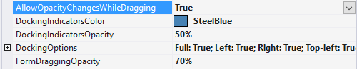
- You can also make the Form change its opacity or transparency while dragging by setting the property AllowOpacityChangesWhileDragging to true. This will also enable you to set the Form’s dragging opacity using the property FormDraggingOpacity to any value between 0 and 100%. Please note that the lower the opacity or transparency level, the lower the visibility of the Form when dragging. You’ll notice the two properties stated in the below Properties window-section:
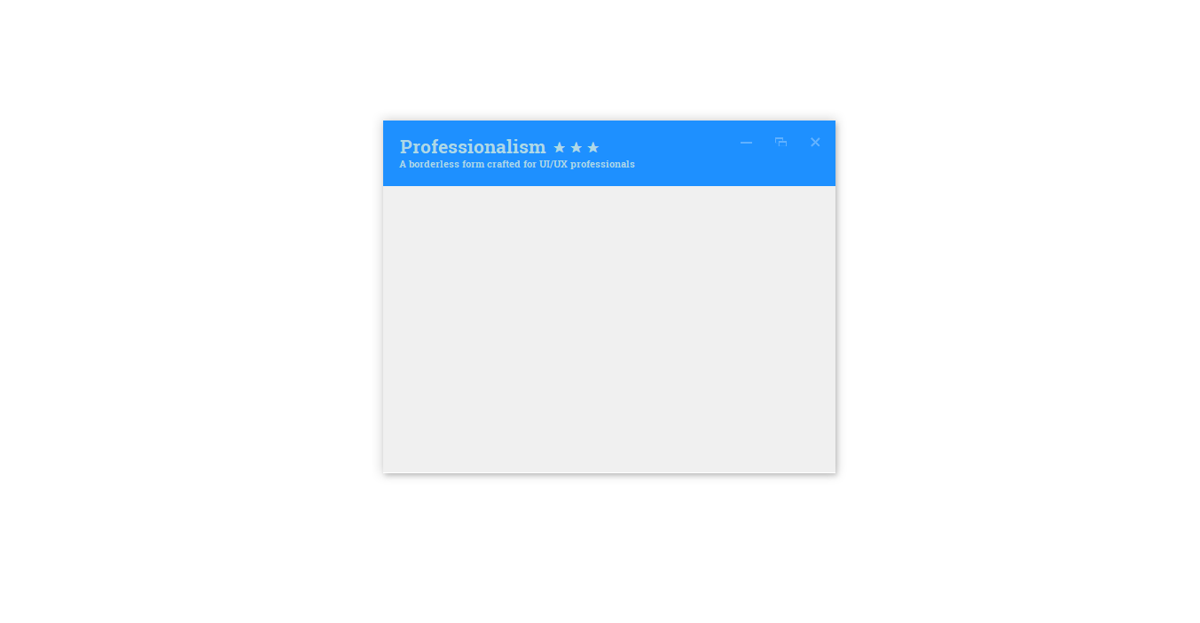
- Here’s our Form in action after we run the project:

- Lastly, you can choose which docking positions are available for your Form at runtime using the DockingOptions property:
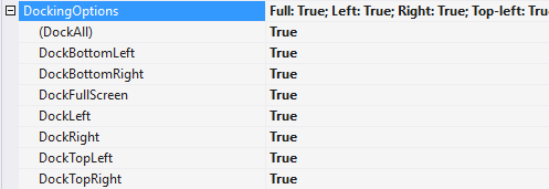
- As shown above, you can set which docking positions will be available for your Form by simply setting a dock position to true or alternatively disabling a dock position by setting it false. Setting the property DockAll to true will automatically set all the available docking options to true while false will disable all the available docking options.
- Also, as explained before, you can change the color and opacity/transparency of the docking indicators to a different color and transparency level respectively as per your own preferences. To do so, please ensure that the property UseBackColorOnDockingIndicators contained within the TitleBarOptions property is set to false.
- So, let’s say we change our DockingIndicatorsColor to Khaki and the DockingIndicatorsOpacity to 100%. Here’s the preview:

- As shown above, you can have many variations of colors and design-points you’d combine in order to make the most fluid and interactive experiences with the Bunifu Form Dock component. It’s always a good consideration to pick a color or colors that do blend well with those used in your application.
Conclusions
I do hope that this article was insightful enough to assist you in designing “live” borderless Windows Forms using Bunifu UI with Visual Studio.

How about mouse resizing by dragging one of the edges ??