


Step by step – designing sales dashboard page
“Design is not just what it looks like and feels like. Design is how it works.” – Steve Jobs
In today’s fast-paced software development world, creating applications that not only function seamlessly but also look polished and modern can be a real challenge. Developers often find themselves spending more time on design tweaks and UI adjustments than on core functionality. What if there was a way to build beautiful, interactive desktop apps without sacrificing time or performance? Enter the Bunifu framework—a comprehensive UI toolkit that empowers developers to craft professional-looking applications with ease.
In this article, we’ll explore how Bunifu Framework can model a desktop version of Software Sales Dashboard.

These useful design tools will help in designing your dashboard faster:
- Bunifu UI Framework library installed. To get a feel for it, download the free trial version
- Similarly, kindly obtain a copy of the “all-things-icons” Icons8 software.
- Just Color Picker tool, which allows you to select colors from any part of the user interfaces.
Before we begin, let’s take a look of the controls:

The Design process
- The first step is to launch a new Visual Studio project, select a C# project, and give it the name “Sales Dashboard.”
- Installing Bunifu UI library by following these steps
- Ensure you have the Bunifu UI library installed in your project. If you haven’t installed it yet, you can do so via NuGet Package Manager in Visual Studio:
- Open Visual Studio, go to Tools > NuGet Package Manager > Manage NuGet Packages for Solution.
- Search for “Bunifu UI” and install the package.
Since we are working with charts, we’ll choose these specific versions when installing via the NuGet Package Manager:
- Bunifu.UI.WinForms -Version 5.3.0
- BunifuCharts.WinForms -Version 1.1.5
- .Net 4.5 – 4.8 – when creating your windows forms.
Table layout
- Table layouts in UI design, especially in frameworks like WinForms or web development, are used to organize and structure the content in a grid-like format
- Make sure it fits your design forms; this will help in the responsiveness of your site.

- Next, you can drag and drop the Bunifu button using the designer or programmatically.
- Option 1: Using the Visual Studio Designer
- Open your form in Design View.
- In the Toolbox, find the Bunifu button under the Bunifu UI Controls section (you may need to scroll).
- Drag the Bunifu button onto your form.
- Resize and position it as desired using the drag handles.
- You can customize properties such as background color, border radius, shadow, etc., in the Properties panel.
- Option 2: Adding the Panel Programmatically
- If you prefer to add the Bunifu button through code, you can do so in your form’s code-behind:
Setting up the Bunifu Label as a Heading
- Step 1: Add a Bunifu Label to the Form
- From the toolbox, drag and drop a BunifuLabel onto your form
Step 2: Customize the Font
- To make the label stand out as a heading, change the font style:
- Set the Font property to Inter Bold.
- Adjust the Font Size to 18 to ensure it’s prominent
Adding and Customizing the Image Button for the Sales Store:
- Drag and drop the BunifuImageButton onto the form where you’d like to display the sales store icon or logo.
- Choose an image that represents the store, like a shopping cart or store logo.
- Go to the Image property in the Properties window, click the ellipsis (…), and browse to your desired image file.
- Set the size of the image button to fit the form’s layout and the image’s dimensions. You can adjust both the Width and Height properties in the Properties window or via code
- Drag and drop several BunifuLabel controls onto the panel. Each label can represent a menu item, such as “Dashboard,” “Sales,” or “Settings.”
- Set the Text property for each label to the corresponding menu item.
- Next, we’ll add icon images for our labels using the bunifuimage icon
- Drag and drop a BunifuPictureBox next to each label. These will serve as icons that accompany the text.
- Download appropriate icons from Pichon and set the Image property of the BunifuPictureBox to the downloaded icons.
- Adjust the size of each picture box to ensure the icons fit well
- Download appropriate icons from Pichon and set the Image property of the BunifuPictureBox to the downloaded icons.
- Make sure each Bunifuicon image button is aligned to the left of its respective label for a clean look. You can position them manually in the designer or adjust properties in the code.
The final output after designing the side panel should look like below:

Adding Profile Controls Using Bunifu in a TableLayout for Enhanced Layout Management
Start by adding a TableLayoutPanel
- The first step is to add a
TableLayoutPanelto your form. This layout container will help you organize the profile image, username, and subheading neatly in separate rows or columns.
- Add the Profile Image using
BunifuImageButton
Instead of a static image, we useBunifuImageButtonfor added interactivity. Users can hover over the profile image or even click on it to trigger an action (e.g., opening profile settings). - we’ll use the we’ll set the image icon with the a rowspan of two for displaying the profile image in position.
- To improve spacing and the overall layout, ensure that the picture box and label are properly aligned. You can adjust their positions within the card to achieve a balanced look.
In the last part of our side panel, we’ll add a logout button using the bunifu button
- Below or inside the card, add a BunifuButton labeled “Logout.”
- Set the Text property of the button
- Customize the button’s color, size, and font to match the overall UI:
- Set the font to Inter 11 for consistency
- Adjust the size and color properties to make the button stand out
Make the button functional by adding a click event that logs the user out or closes the application using the code below:
The final look of our side panel will look as shown below:

Setting Up the Top Panel
- First, drag and drop a tablelayout which manages our UI components in a grid-like format and for responsiveness of our control.
- Resize it correctly to match our needs.
- Next, we add bunifu label onto the top of the form to serve as the header or navigation bar.
- Next, we set the background color and any other visual properties to match the overall theme of the application.
- Next, we’ll add a
BunifuTextBoxthat will serve as the search box for your application. Bunifu provides an out-of-the-box search box style that fits well into modern UI designs, giving users a smooth and responsive experience.
The final outlook will look as below:

Let’s move to the next frame:
Setting Up a BunifuCard to Display Revenue Information
- Drag and drop a BunifuCard from the toolbox into the body section of your form. This card will act as a container for key data, such as revenue.
- Inside the card, add a BunifuLabel to show the title or description of the data being displayed (e.g., “Total Revenue”)
- Add another BunifuLabel to display the actual revenue amount (e.g., “$120,000”).
- To give a visual cue, add a BunifuIconImage inside the card, such as a dollar or revenue-related icon.
- Adjust the size and position of the icon
- To further emphasize the data, you can add a small chart icon (e.g., bar or line chart) that indicates financial growth
- Adjust the size and position of the chart icon for balance
The final output of our card will look as shown below:

A peak of the properties used as shown below:

Setting Up a Bar Chart for Sales Percentages Using Bunifu Chart Canvas
- Drag and drop a BunifuChartCanvas onto your form. This component will serve as the container for your bar chart.
- Set up essential properties like axis display and legend from the bunifubarchart dropdown in the bottom dock.
- Configure the string array of the bunifuchart canvas.
- Next, add BunifuBarChart object that will hold the sales data in terms of percentage for each day of the week.
- Add sales percentages as values for each day of the week.
- Assign labels to represent the days of the week.
- Set the bar chart color and other styling options
- Add the configured BunifuBarChart to the BunifuChartCanvas
- Call the Render method to display the chart
Our output will look somewhat below:

We’ll now add a circular progress bar from the bunifu utilities:
- From the toolbox, drag and drop a BunifuCircleProgress to the form.
- ConfigureBunifuCircleProgress Properties: These properties are essential to customize the behavior and appearance of the circular progress bar.
- Next, we’ll incorporate bunifu color transition which allows you to create smooth color transitions or animations between two colors in your application. This feature is especially useful when you want to enhance your UI with dynamic, eye-catching effects without compromising performance.
Some properties used is displayed below:

The final outlook will be as shown below:

Designing a Custom Heatmap Using Buttons
- In this step, we’ll create a heatmap using bunifubutton for displaying total number of sales against days of the week.
- Position the buttons across your form to reflect the various sections of the heatmap. With larger buttons, the heatmap becomes easier to read and provides a more intuitive user experience.

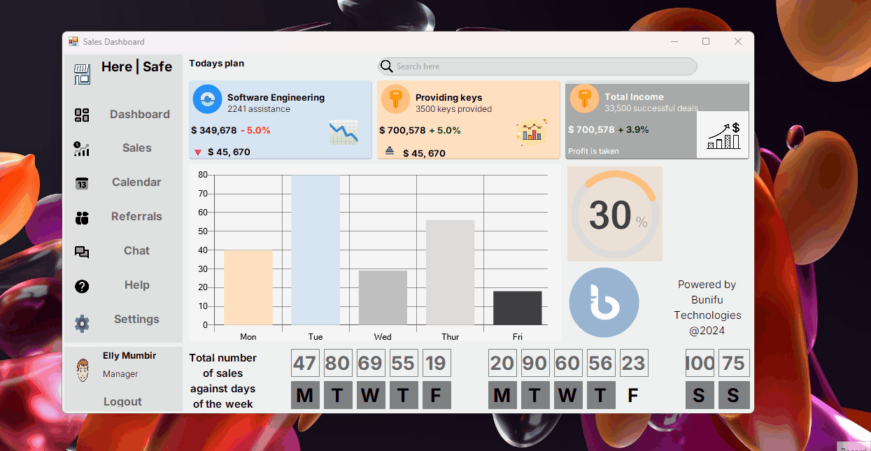
Congratulations on building a sales dashboard using Bunifu components! If you’ve followed this guide, you now have a fully functional, visually engaging dashboard that includes an animated BunifuCircleProgress as well as other components like charts, progress bars, and labels.
If you followed the steps, your output would be looking like below:
Your sales dashboard is now equipped with interactive features that enhance the user experience and make sales data easily digestible thanks to the Bunifu framework . Feel free to continue experimenting by adding more widgets, tweaking the design, or further optimizing the performance.

Leave A Comment