Desktop applications remain essential in many industries due to their reliability, performance, and offline capabilities. In the .NET ecosystem, Windows Forms (WinForms) is a popular framework for building desktop applications. However, traditional WinForms controls often produce outdated user interfaces. Bunifu WinForms is a modern UI framework that enhances WinForms applications by providing sleek, responsive, and visually appealing components. This article discusses the process of designing a desktop application user interface using Bunifu WinForms.
Bunifu WinForms is a third-party UI toolkit designed to modernize Windows Forms applications. It offers customizable controls such as buttons, text boxes, panels, charts, and animations. These controls follow modern design principles, including flat design, smooth transitions, and responsive layouts. Bunifu WinForms allows developers to focus on functionality while achieving professional UI designs with minimal effort.
This article will showcase the extensive and detailed use of Bunifu WinForms to designing the UI given beforehand.
Tools and Technologies used
The design of the given desktop application UI typically involves the following tools and technologies:
Get an Inspiration from Dribble
Dribbble is great because it gives you quick access to high-quality, real-world design work from professionals around the globe. You can explore modern UI/UX trends, color palettes, typography styles, and layout ideas all in one place, which helps spark creativity and refine your own design direction.
Designs are usually shared as focused “shots,” making it easy to study specific elements like buttons, dashboards, or mobile screens without distractions.
Dribbble acts as a visual benchmark—helping you stay current, improve your aesthetic sense, and translate fresh ideas into practical designs.
Here’s the link to the site https://dribbble.com/search/desktop-app-ui
Tool for color sampling
A color picker is used to easily select, identify, and reuse colors in a design. It helps maintain consistent color schemes, match colors accurately from existing elements, and experiment with different color combinations quickly without guessing color values.
Here’s the link for downloading just color picker
https://just-color-picker.en.softonic.com/download?installerType=reinstaller
Tool for icons
Icons8 offers a huge library of icons, illustrations, and UI assets in multiple styles, making it easy to find visuals that match your design theme. You can download icons in different formats (PNG, SVG, etc.), customize colors and sizes, and use them directly in web, mobile, or desktop applications—saving time while keeping your UI consistent and polished.
https://icons8.com/icons
• Programming Language: C#
• Framework: .NET Framework or .NET(Latest Version)
• IDE: Microsoft Visual Studio
• UI Library: Bunifu WinForms UI
• Design Approach: Dribble
• Just Color Picker: Used for color sampling
• Icons8: Used for icons
Introduction
The user interface was designed using Bunifu WinForms controls within the Visual Studio designer. A main form was created to act as the application dashboard. Bunifu panels were used to structure the layout, while Bunifu buttons provided navigation between different sections of the application.
Bunifu text boxes were implemented for data input, offering built-in validation and visual feedback. Icons were added to buttons to improve interaction and visual clarity. Color themes were applied consistently across all forms to maintain a professional appearance.
Here is an example from the design that illustrate the use of Microsoft Visual Studio and Bunifu WinForms UI in use:
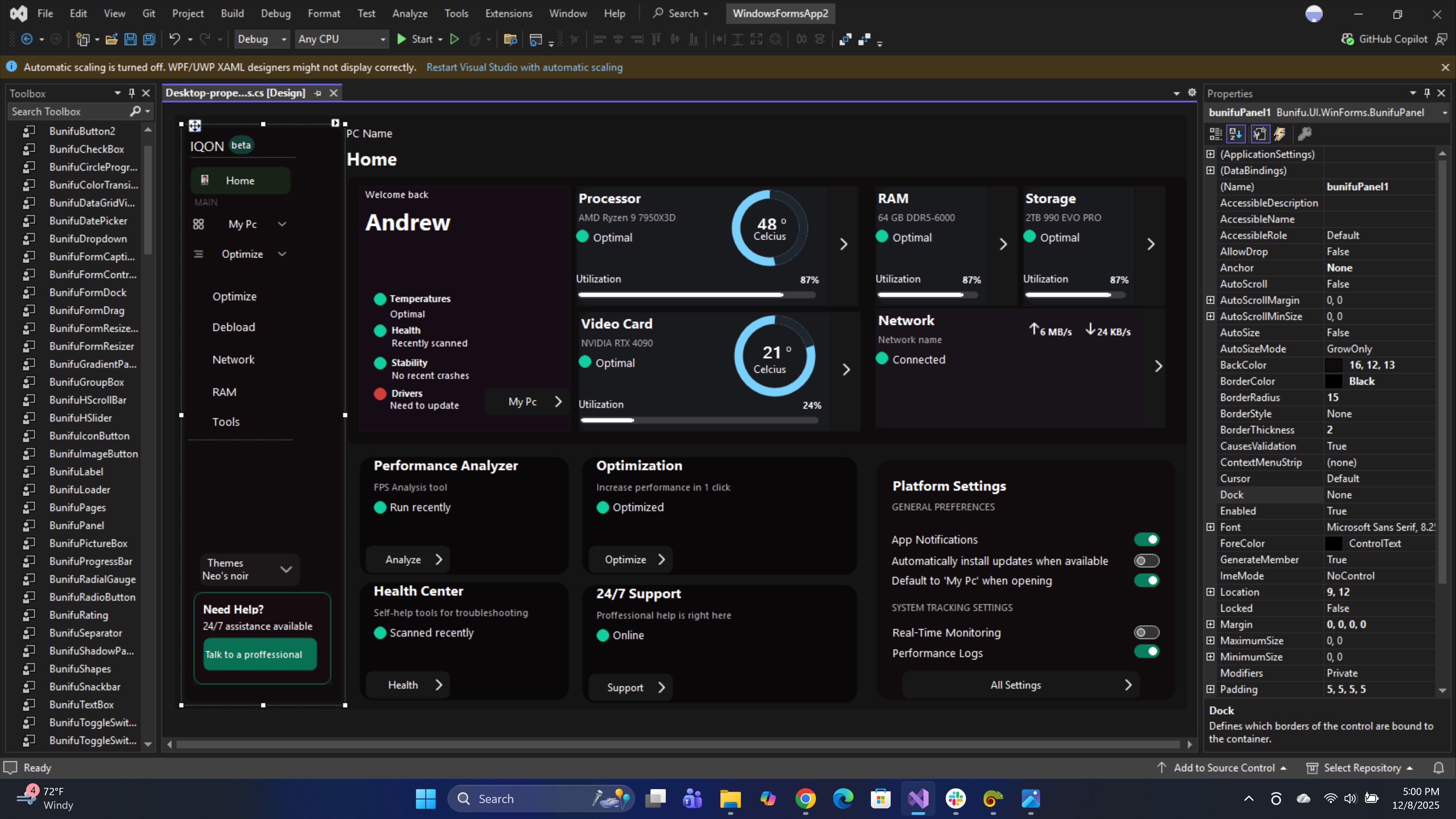
From the image we can see the use of BunifuPanel, BunifuButtons, BunifuSeparator, BunifuCircleProgress and BunifuLabels.
Bunifu WinForms allows extensive customization of UI components. Properties such as border radius, hover effects, fonts, and colors were adjusted to match the application’s branding.
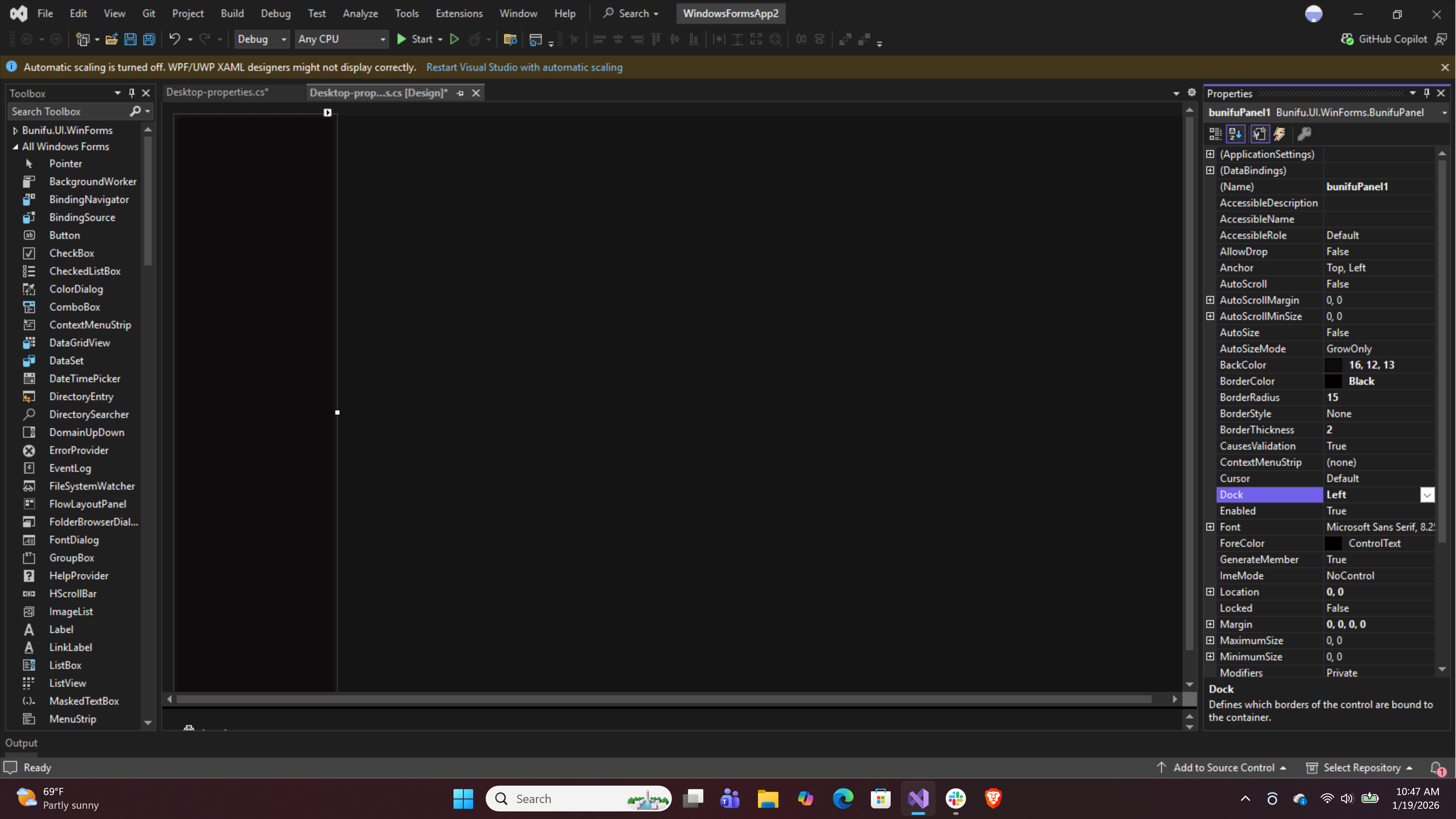
Add a BunifuPanel named pnlSidebar, then set Dock = DockStyle.Left to create the sidebar.
The sidebar uses BunifuButtons with icons, hover effects, and active-state highlighting to enhance usability. The selected section is visually emphasized, ensuring users can easily identify their current location within the application.
The sidebar also includes a theme selector and a support card, demonstrating thoughtful UI organization and user assistance integration.
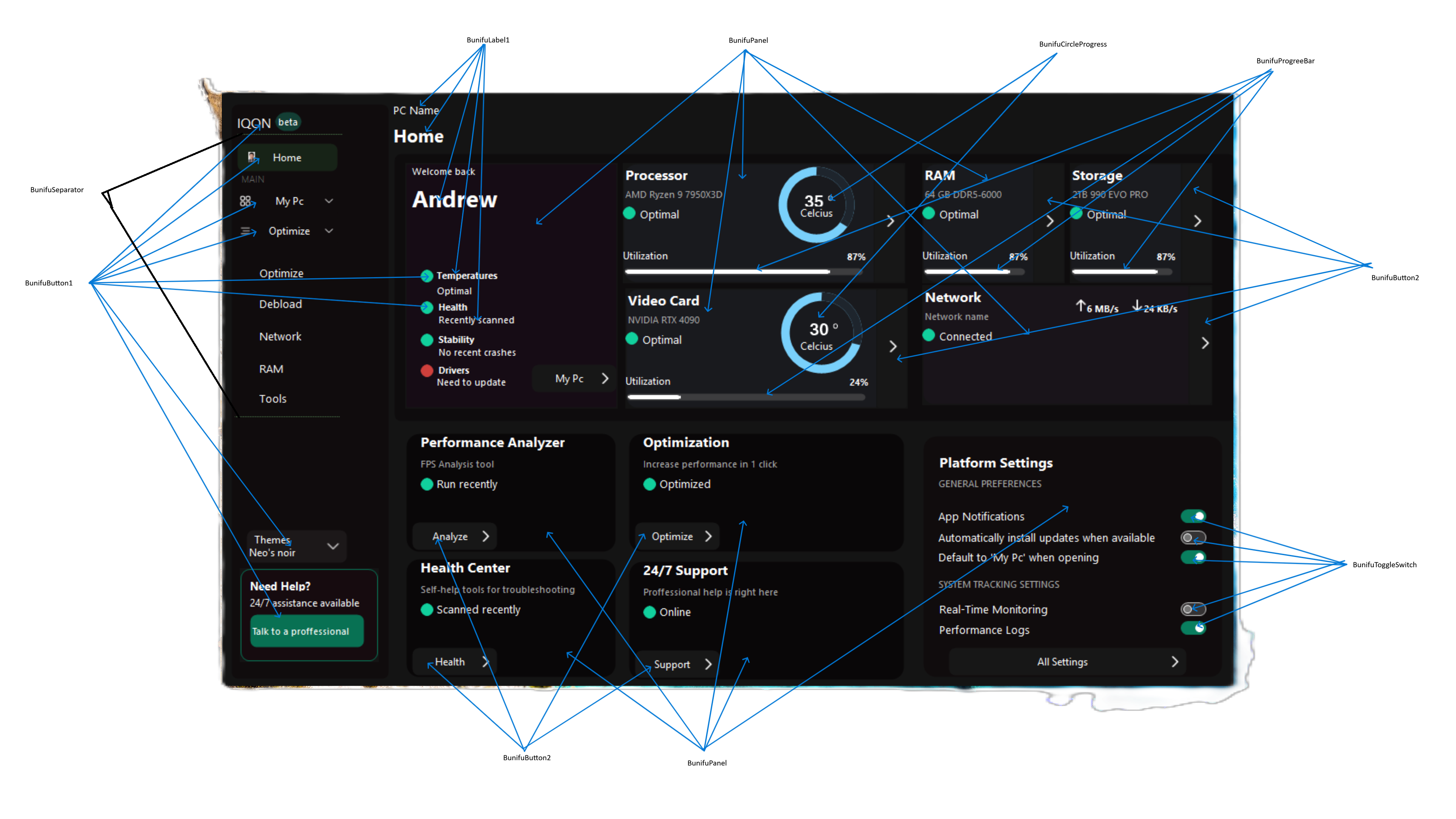
BunifuPanel
Bunifu Panel is an enhanced version of the basic Windows Forms Panel control. It can act as a container for a collection of controls within the form designer or it can be used to configure a form’s layout. https://docs2.bunifuframework.com/docs/ui/controls/bunifu-panel
BunifuButton
BunifuButton is truly one of a kind type of button. There’s so much you can achieve with this one control, and so effortlessly easy to customize you’d wonder how you lived without it… With over 12 design styles built right into it, all you need is a little bit of creativity and you’re ready to craft something beautiful https://docs2.bunifuframework.com/docs/ui/controls/bunifu-button
BunifuSeparator
Bunifu Separator is a rich and modest .NET line control that allows us to partition user interface layouts, resulting in a modular interface design. https://docs2.bunifuframework.com/docs/ui/controls/bunifu-separator
BunifuCircleProgress
Bunifu Circle Progress is a .NET control curated beautifully to visualize progress information of activities within your application. It gives you the flexibility to have an elegant appearance by presenting you with great properties that will provide visually compelling ways to showcase a single statistic. Here’s an illustration whereby Bunifu Circle Progress has been used into showing statistics of weather temperature changes at different times of the day: https://docs2.bunifuframework.com/docs/ui/controls/bunifu-circle-progress
BunifuProgressBar
Bunifu Progress bar is a.NET control, that simulates the progress of a task with customizable visuals. We have taken the normal progress bar a notch higher with features such as the ability to visualize progress in multiple orientations, the ability to customize progress ranges with gradient colors, and the ability to set rich progress animations. https://docs2.bunifuframework.com/docs/ui/controls/bunifu-progress-bar
BunifuToggleSwitch
Bunifu Toggle Switch Button control is a rich two-state button, perfect for when you need to provide the user with an option to flip a switch. It has highly customizable toggle settings and features such as animations that will blend into the look and feel of your WinForms application. https://docs2.bunifuframework.com/docs/ui/controls/bunifu-toggle-switch
BunifuLabel
Bunifu Label is a rich .NET control that allows us to provide rich appealing texts inside our Windows Forms applications. It extends the basic properties of the standard Windows Form Label by adding support for HTML-based text tags and inline CSS styles. https://docs2.bunifuframework.com/docs/ui/controls/bunifu-label
Timer
A Timer refers to the System.Windows.Forms.Timer component for UI-based apps or System.Timers.Timer for background tasks, used to execute code at set intervals (milliseconds) via the Tick event, controlled by Interval and Enabled properties, found in the Toolbox for Windows Forms or through code for other projects like VS Code extensions for countdowns or execution tracking.
Overall Layout Structure
The desired UI will have this layout and we will do a step by step process to achieve it as explained below.
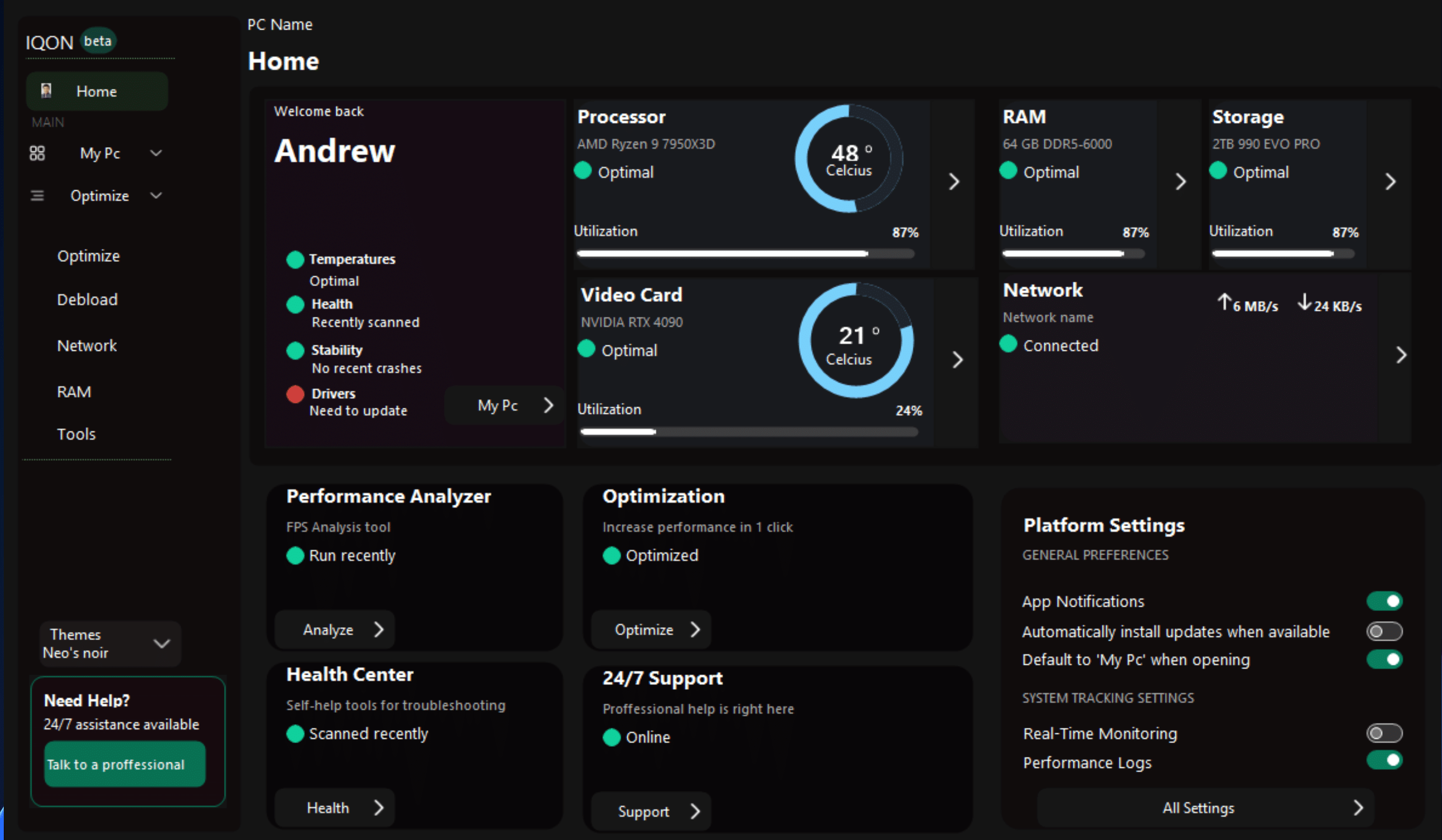
The interface is divided into three primary sections: a left-aligned sidebar navigation panel, a main card grid content area, and a lower-grid area. This structure is achieved using panel docking, where the sidebar is docked to the left of the form and the main content panel fills the remaining space. This layout ensures consistent alignment and responsiveness when the application window is resized.
Sidebar Navigation Panel
The sidebar acts as the central navigation hub of the application. It contains the application branding at the top, followed by a list of navigation buttons such as Home, My PC, Optimize, Debload, Network, RAM, and Tools. These navigation items are implemented using Bunifu buttons with icons, providing clear visual cues for each function.
The label “MAIN” is used to group related menu items, improving readability and navigation flow. Additional elements such as theme selection and a help section are placed at the bottom of the sidebar, making efficient use of vertical space without cluttering the main menu.
Header Row
At the top of the main content area, a header section displays the current page title (Home) along with the system or PC name. Directly below this,
Main Card Grid
The main card grid of the dashboard features multiple information cards that display real-time system metrics. A personalized welcome card presents the user’s name and a brief system health summary. Status indicators such as temperature, health, stability, and driver state are displayed using color-coded icons to provide instant feedback on system condition.
These cards include details for the Processor, RAM, Storage, Video Card, and Network. Each card presents key data such as component name, operational status, utilization percentage, and temperature readings.
Circular progress indicators and usage bars are used to visualize system performance, making the information easy to interpret at a glance. The consistent card design creates visual harmony and helps users quickly compare system components.
Lower grid
Below the system overview, additional cards provide quick access to application tools and services. Sections such as Performance Analyzer, Optimization, Health Center, and 24/7 Support are presented as interactive cards with brief descriptions and call-to-action buttons. This design encourages user interaction while keeping advanced tools easily accessible.
Platform Settings Panel
On the right side of the dashboard, a Platform Settings card allows users to manage general preferences and system tracking options. Toggle switches are used for features such as app notifications, real-time monitoring, and performance logging. This settings panel provides immediate access to frequently used configuration options without navigating away from the Home screen.
Design Consistency and Visual Style
The interface uses a consistent dark color palette combined with subtle shadows, rounded corners, and smooth spacing. Bunifu UI components such as panels, labels, progress indicators, and toggle switches contribute to a polished and professional appearance. Icons sourced from icon libraries further enhance usability by visually reinforcing each feature.
Let’s now Design the UI
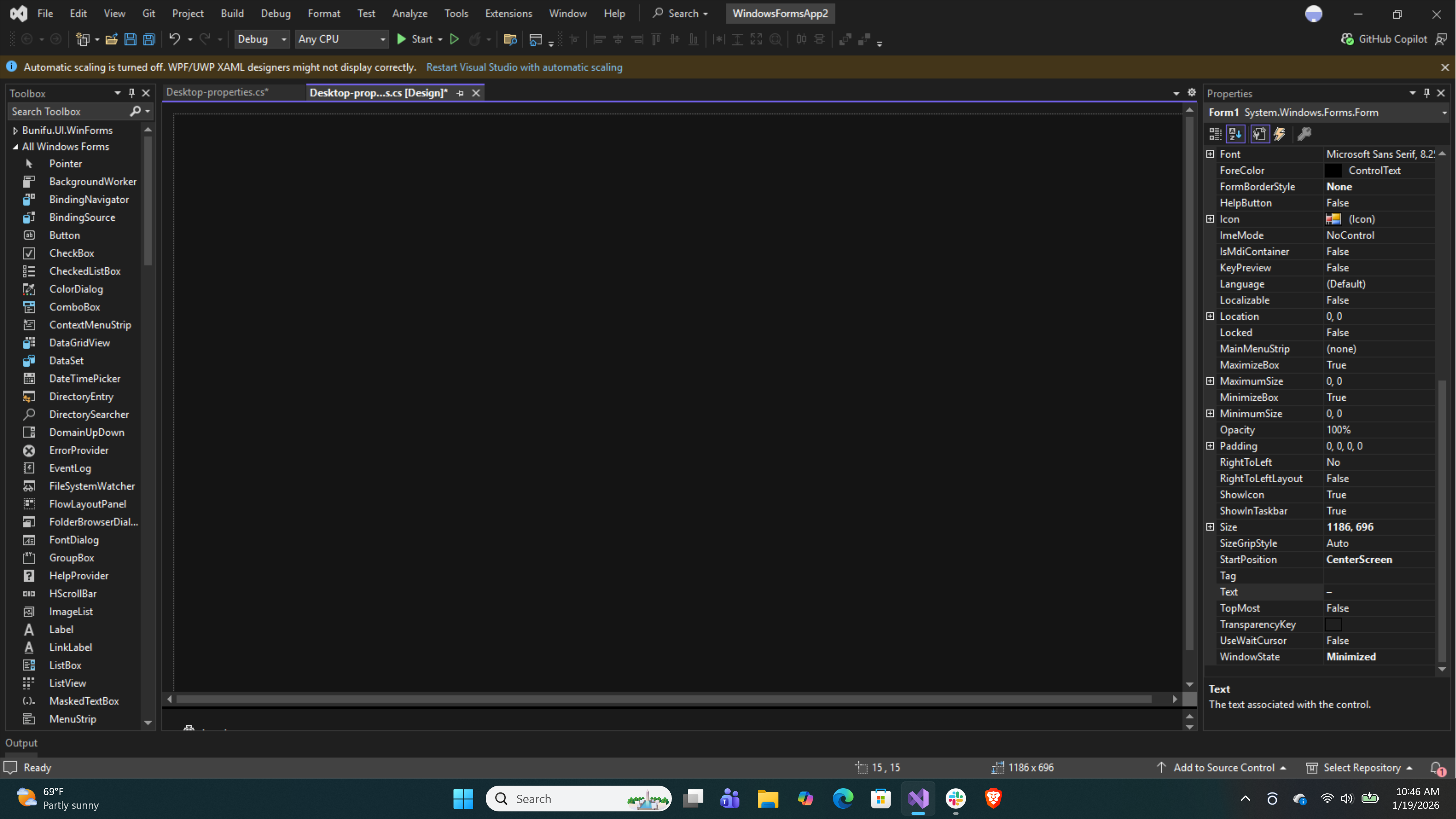
First we will start a new project in Visual Studio and name it System Performance Manager.
Once the form appears set an appropriate size to fill all the controls.
• Size: 1186, 696
• StarPosition: Centre Screen
• MinimumSize: 0, 0
• BackColor: 20, 20, 20
Add BunifuPanel to the form
Go to toolbox and search for BunifuPanel and drag to the form.
Set the properties of the Panel as follows:
• BackColor: 16, 12, 13
• Dock: Left
• BorderColor: Black
• Size: 189, 678
• Padding: 5, 5, 5, 5
• Anchor: Top Left
Add Buttons for the sidebar
After setting the BunifuPanel, let’s add the buttons for the navigation.
Search in the toolbox for BunifuButton and drag onto your sidebar.
Set the properties to:
• OnDisabledState:
BorderColor:191, 191, 191
FillColor:204, 204, 204
ForeColor:168, 160, 168
• OnHoverState:
BorderColor:30, 150, 255
FillColor:30, 150, 255
ForeColor:White
• OnIdleState:
BorderColor:Transparent
FillColor:16, 12, 13
ForeColor:white
• OnPressedState:
BorderColor:40, 96, 144
FillColor:40, 96, 144
ForeColor:White
• Size:118, 33
• TextAlign: MiddleCenter
• IconLeft: Import from your folder of icons
• IconLeftPadding:0, 0, 0, 0
• IconRight: Import from your icons folder
• IconRightPadding:3, 3, 7, 3
• ForeColor:White
The same is applied for the rest of the Buttons in the sidebar.
Add BunifuPanels
After adding the Buttons, we now add panels that will constitute the main data grid.
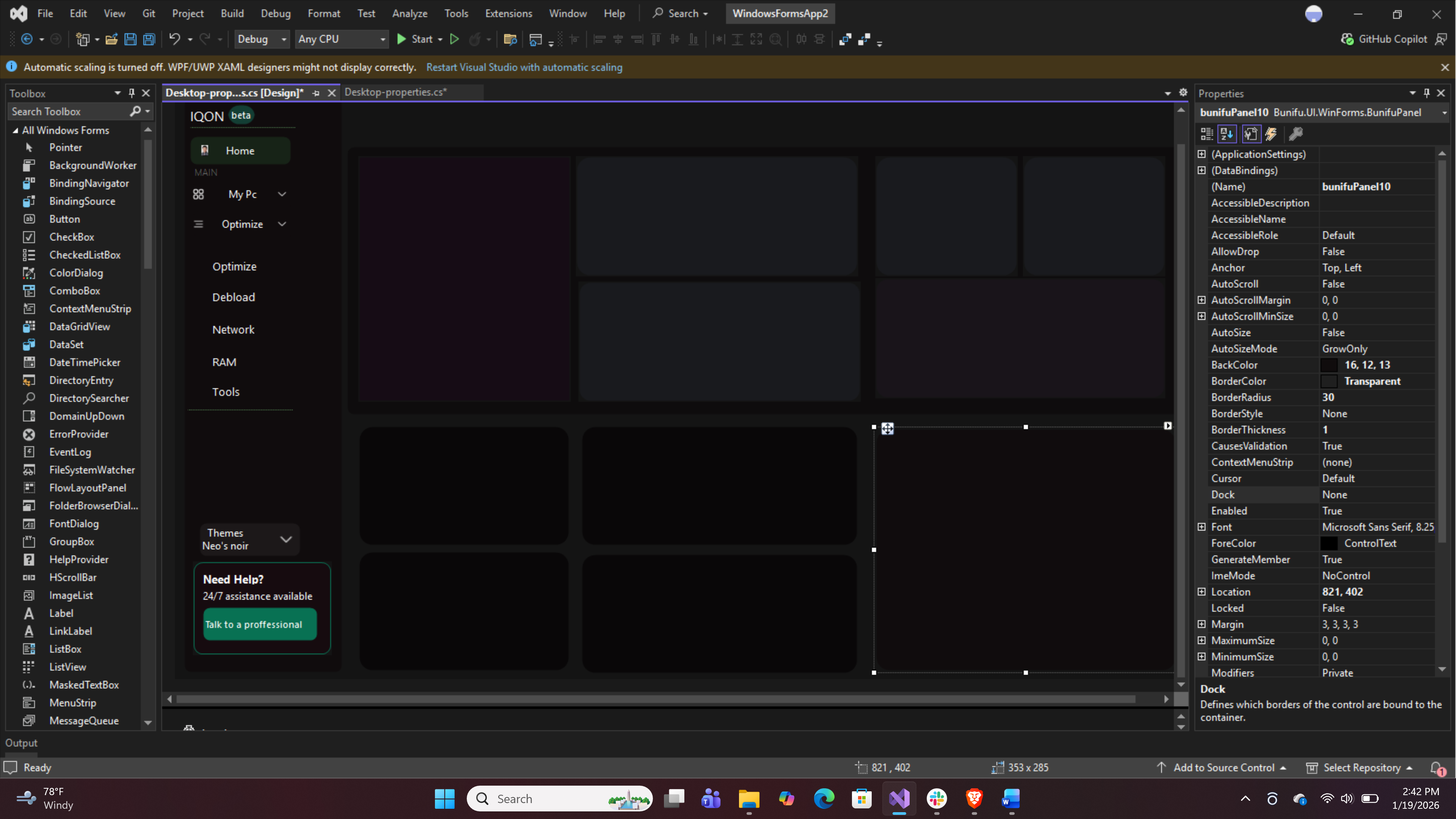
Drag BunifuPanel from the toolbox and set properties as follows:
• ForeColor:ControlText
• BorderColor:Transparent
• BorderRadius:15
• Margin:3, 3, 3, 3
The same pattern is reused across the Form.
Add BunifuLabel
From the toolbox search and drag BunifuLabel to the form.
Set the properties as follows:
• Font:Segoe UI
• ForeColor:White
• TextAlign:TopLeft
• BackColor:Transparent
Reuse these properties, changing the text accordingly.
Add BunifuProgressBar
Search and drag from the toolbox the BunifuProgressBar.
Set the properties as follows:
• BackColor: 61, 61, 63
• BorderColor: Transparent
• BorderRadius: 9
• ProgressColorLeft: White
• Size: 285, 10
• Value: 87
Add BunifuToggleSwitch
Search from the toolbox for BunifuToggleSwitch
Drag and set the following properties
• BackColor: Transparent
• ForeColor: ControlText
• Size: 30, 16
• ToggleStateDisabled:
BackColor: DatkGray
BackColorInner: White
BorderRadius: 17
BorderColor: DarkGray
• ToggleStateOff:
BackColor: 53, 51, 52
BackColorInner: White
BorderRadius: 15
BorderColor: 191, 191, 191
• ToggleStateOn:
BackColor: 9, 127, 95
BackColorInner: White
BorderRadius: 15
BorderColor: 9, 127, 95
Add BunifuCircleProgress
Drag from the toolbox BunifuCircleProgress
Set the properties to:
• ProgressBackColor: 121, 208, 251
• ProgressColor:30, 37, 45
• Size:99, 99
• SubScriptColor: White
• ValueMargin: 0, 5, 0, 15
Add timer from the toolbox
Preview
This is a preview of the project when run.
“Success is peace of mind, which is a direct result of self-satisfaction in knowing you made the effort to become the best of which you are capable.” – John Wooden
Conclusion
This project shows how Bunifu WinForms can be used to design a modern, functional, and visually engaging desktop application UI. Through the use of card-based layouts, intuitive navigation, real-time system monitoring, and consistent styling, the application delivers a user-friendly experience while presenting complex system data in a clear and accessible manner. This design highlights the effectiveness of Bunifu WinForms in modernizing traditional WinForms desktop applications.



Leave A Comment